
Feature: Prolific Album and Poster Designer Darryl Norsen
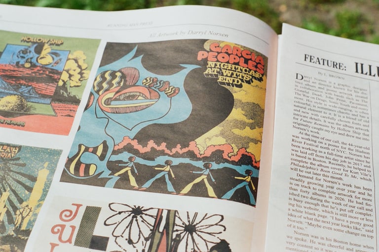
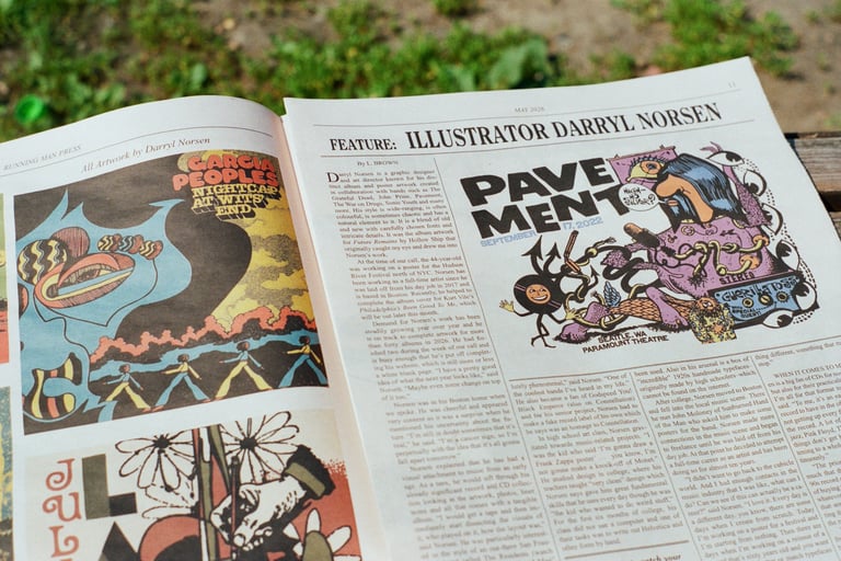
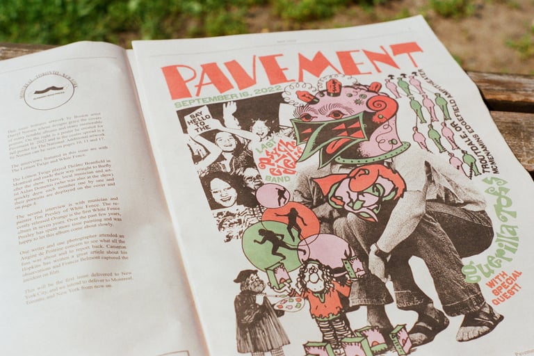
Darryl Norsen has collaborated with The Grateful Dead, John Prine, Pavement, The War on Drugs, Sonic Youth and many more.
ARTICLE
L. Brown
7/9/20266 min read
About fifteen years ago, Norsen was writing a Grateful Dead column for Aquarium Drunkard and making bootleg designs. The Jerry Garcia estate became interested and reached out to ask if he would like to write some liner notes. Norsen agreed. They then asked him to redraw the famous alligator on Garcia’s 1955 Fender Stratocaster. From there, things snowballed and Norsen took on several Grateful Dead-related projects.
When he was a teen, Norsen found a record by Hangedup in the dollar bin at a record store, which was his introduction to Montreal’s Constellation Records. “They [Hangedup] were absolutely phenomenal,” said Norsen. “One of the coolest bands I’ve heard in my life.” He also became a fan of Godspeed You! Black Emperor (also on Constellation) and for his senior project, Norsen had to make a fake record label of his own which he says was an homage to Constellation.
In high school art class, Norsen gravitated towards music-related projects. “I was the kid who said ‘I’m gonna draw a Frank Zappa poster’ … you know, I’m not gonna make a knock-off of Monet.” He studied design in college, where his teachers taught “very clean” design which Norsen says gave him great fundamental skills that he uses every day though he was “the kid who wanted to do weird stuff.” For the first six months of college, his class did not use a computer and one of their tasks was to write out Helvetica and other fonts by hand.
Norsen now has a sharp eye for identifying fonts, though it can still be difficult. “I spend so much time trying to match fonts, to get fonts, that it’s kind of second nature in a weird way,” he said. “There are a lot of times that I can pinpoint something pretty quickly and if I don’t know the name, I know where I can find it pretty quickly.”
He sang the praises of fontsinuse.com, a public archive of typography displaying where and how specific fonts have been used. Also in his arsenal is a box of “incredible” 1920s handmade typefaces–originally made by high schoolers–which cannot be found on the internet.
After college, Norsen moved to Boston and fell into the local music scene. There he met John Moloney of Sunburned Hand of the Man who asked him to make some posters for the band. Norsen made more connections in the music scene and began to freelance until he was laid off from his day job. At that point he decided to attempt a full-time career as an artist and has been doing so for almost ten years.
“I didn’t want to go back to the cubicle world. And I had enough contacts in the music industry that I was like, what can I do? Can we see if this can actually be a career?” said Norsen. “I love it. Every day is a different day, you know, there are some days when I create from scratch. Today I’m working on a poster for a festival and I’m starting from nothing. Then there are days when I’m working on a reissue of a record that’s sixty years old and you want to make it look better or match typefaces or work on the layout.”
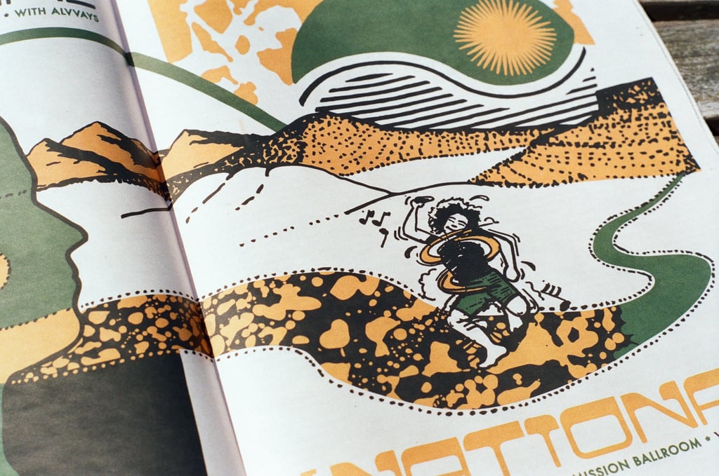
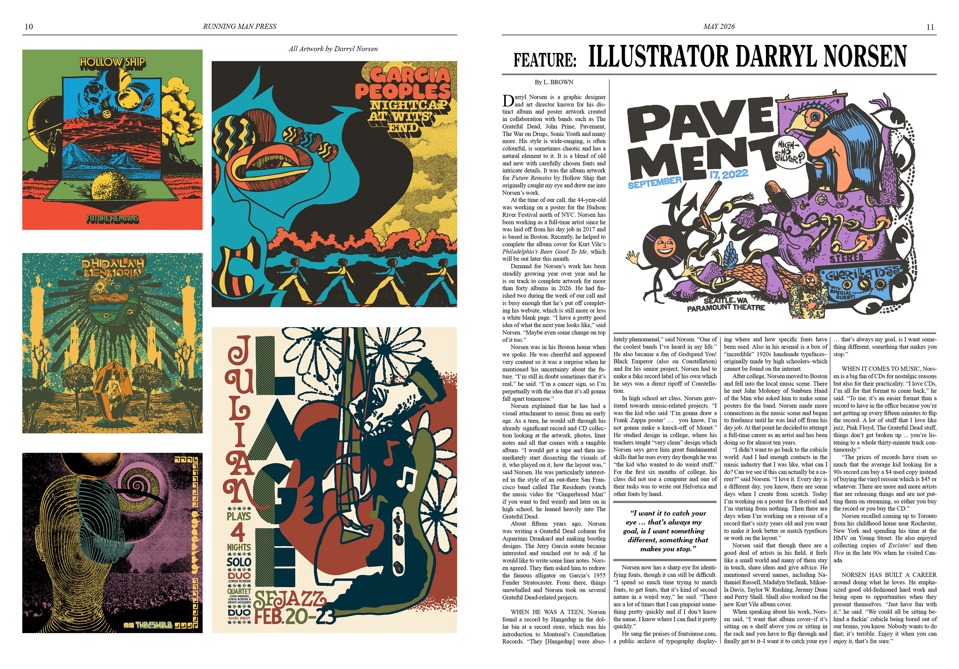
Darryl Norsen is a graphic designer and art director known for his distinct album and poster artwork created in collaboration with bands such as The Grateful Dead, John Prine, Pavement, The War on Drugs, Sonic Youth and many more. His style is wide-ranging, is often colourful, is sometimes chaotic and has a natural element to it. It is a blend of old and new with carefully chosen fonts and intricate details. It was the album artwork for Future Remains by Hollow Ship that originally caught my eye and drew me into Norsen’s work.
At the time of our call, the 44-year-old was working on a poster for the Hudson River Festival north of NYC. Norsen has been working as a full-time artist since he was laid off from his day job in 2017 and is based in Boston. Recently, he helped to complete the album cover for Kurt Vile’s Philadelphia’s Been Good To Me, which will be out later this month.
Demand for Norsen’s work has been steadily growing year over year and he is on track to complete artwork for more than forty albums in 2026. He had finished two during the week of our call and is busy enough that he’s put off completing his website, which is still more or less a white blank page. “I have a pretty good idea of what the next year looks like,” said Norsen. “Maybe even some change on top of it too.”
Norsen was in his Boston home when we spoke. He was cheerful and appeared very content so it was a surprise when he mentioned his uncertainty about the future. “I’m still in doubt sometimes that it’s real,” he said. “I’m a cancer sign, so I’m perpetually with the idea that it’s all gonna fall apart tomorrow.”
Norsen explained that he has had a visual attachment to music from an early age. As a teen, he would sift through his already significant record and CD collection looking at the artwork, photos, liner notes and all that comes with a tangible album. “I would get a tape and then immediately start dissecting the visuals of it, who played on it, how the layout was,” said Norsen. He was particularly interested in the style of an out-there San Francisco band called The Residents (watch the music video for “Gingerbread Man” if you want to feel weird) and later on in high school, he leaned heavily into The Grateful Dead.
Running Man Press Vol. 2 No. 2
Norsen said that though there are a good deal of artists in his field, it feels like a small world and many of them stay in touch, share ideas and give advice. He mentioned several names, including Nathaniel Russell, Madalyn Stefanik, Taylor W. Rushing, Jeremy Dean and Perry Shall. Shall also worked on the new Kurt Vile album cover.
When speaking about his work, Norsen said, “I want that album cover–if it’s sitting on a shelf above you or sitting in the rack and you have to flip through and finally get to it–I want it to catch your eye … that’s always my goal, is I want something different, something that makes you stop.”
When it comes to music, Norsen is a big fan of CDs for nostalgic reasons but also for their practicality. “I love CDs, I’m all for that format to come back,” he said. “To me, it’s an easier format than a record to have in the office because you’re not getting up every fifteen minutes to flip the record. A lot of stuff that I love like jazz, Pink Floyd, The Grateful Dead stuff, things don’t get broken up ... you’re listening to a whole thirty-minute track continuously.”
“The prices of records have risen so much that the average kid looking for a 90s record can buy a $4 used copy instead of buying the vinyl reissue which is $45 or whatever. There are more and more artists that are releasing things and are not putting them on streaming, so either you buy the record or you buy the CD.”
Norsen recalled coming up to Toronto from his childhood home near Rochester, New York and spending his time at the HMV on Young Street. He also enjoyed collecting copies of Exclaim! and then Vice in the late 90s when he visited Canada.
Norsen has built a career around doing what he loves. He emphasized good old-fashioned hard work and being open to opportunities when they present themselves. “Just have fun with it,” he said. “We could all be sitting behind a fuckin’ cubicle being bored out of our brains, you know. Nobody wants to do that; it’s terrible. Enjoy it when you can enjoy it, that’s for sure.”
Running Man Press Vol. 2 No. 2
Running Man Press Vol. 2 No. 2
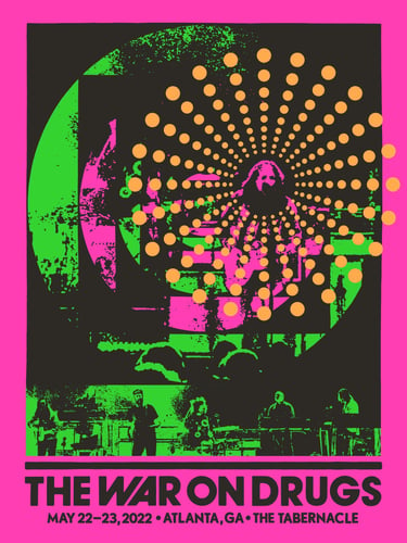
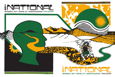
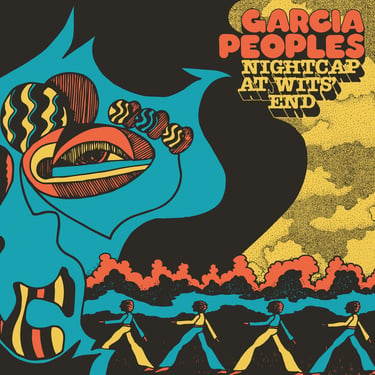
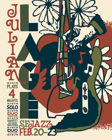
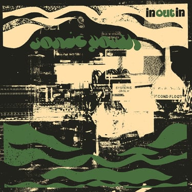
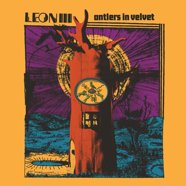
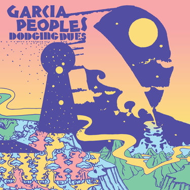
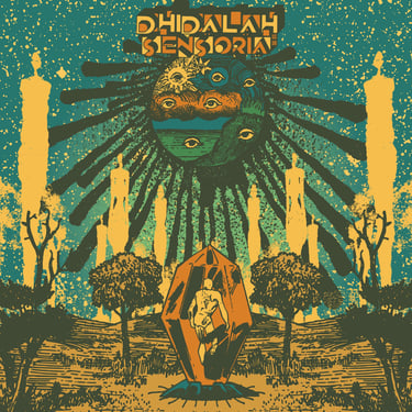

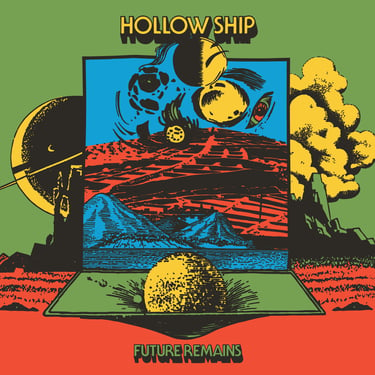
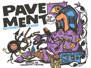
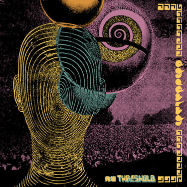
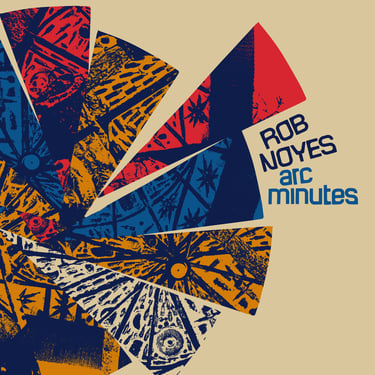
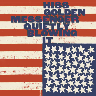
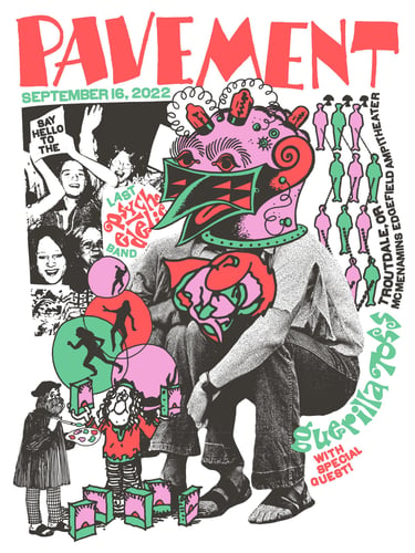
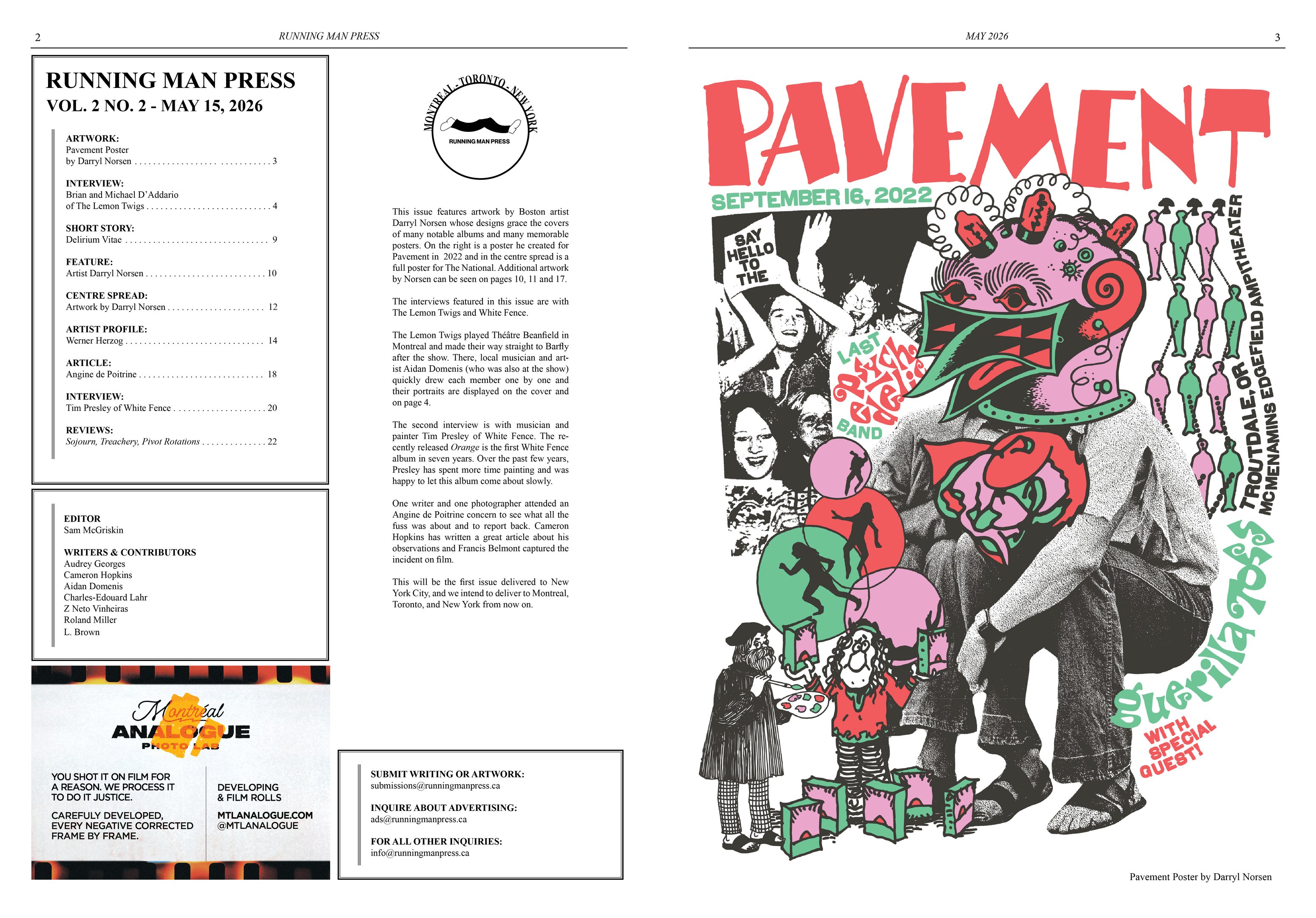
All artwork below is by Darryl Norsen. To see more visit his Instagram page here.
RUNNING MAN PRESS
CoNTACT
info@runningmanpress.ca
© 2024. All rights reserved.
ads@runningmanpress.ca